Tag Archives: Drawing Pencil

Pencil portrait drawing of Kurt Cobain.

This pencil portrait drawing of Kurt Cobain was drawn in June 2011.

The pencil portrait drawing was an experiment for trying out some ideas, I made some quick sketches with different tools that where all dismal failures and I should have realized that there was something difficult about this image making it troublesome.

I chose Kurt Cobain, front man for Nirvana, the Grunge band, mainly  because I have had a relationship with him that was one sided as a fan during his and my life, through the television, newspapers, and radio, all with their own brand of creative news.

One starts and they all jump on the gravy train, creating portraits and I am no different except mine is only a pencil portrait drawing.

Here I am doing the same thing as them drawing a pencil portrait drawing of a common old rock star because he is familiar and recognizable.
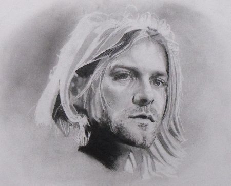
Pencil Portrait Drawing Kurt Cobain
Pencil portrait drawing of Kurt Cobain before getting to the final detail.

I enjoyed Nirvana probably because nothing good happened for me during the late 80’s early 90’s with guitar based bands and I had drifted off into little fluffy clouds, 808 State, rave music. Kraft Work had become popular again and I had been into them much earlier as well, just like, good night Vienna, Ultravox, guitar music was dead and then came Nirvana, and it was Nirvana. No more Mini Moogs and Oberhimer’s, it was Fender guitars and amplifiers, it was aggression, raw complaints and vague lyrics, “I’m so ugly, that’s OK cos so are you”.

All this and the media portrayal of a troubled soul, leading to his suicide, probably adhered me to Kurt Cobain giving me a good reason for drawing a common old dead rock star, dead but not forgotten.

I chose this image of Kurt Cobain from an Unplugged episode for a number of reasons, one of which was because he was not quite looking at the camera, which I think makes a more interesting portrait of somebody, caught unawares.  The image actually looks like he has been caught day dreaming and he is not actually focused or aware of his real surroundings, I think the image portrays this, whether it’s true or not.

The pencil portrait drawing.
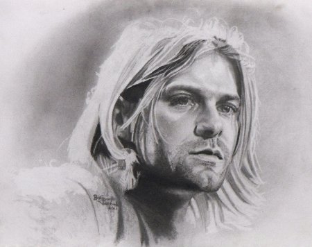
 

Kurt Cobain pencil portrait drawing perhaps finished V1
Kurt Cobain pencil portrait drawing, after picking out the detail, perhaps the finished V1

I did not realize how difficult this was going to be until I tried to capture it and the eyes caused me problems. I chose these eyes because they where wet, glassy, reflecting stage lighting but only prominently in Kurt’s left eye on your right hand side, those other glints that are there but dimmed out, where difficult to get to the right tone.  The light reflecting in the iris of the left eye was also difficult for the same reasons.

I chose these elements because they are strong along with the stubble and the hair, as my intentions where to only suggest Kurt Cobain, I failed to satisfy these intentions in this drawing I think, yet learned so much more that I will use.

All of these aspects are what makes the drawing good but much more difficult with a need for deadly accuracy to capture the qualities of the subject but I made it difficult because I did not want it to be photographic, either. I had intentionally chosen an image with lots of marks in it, so as to be more able to use hatch marks as well as tonal modelling. This meant there was a lot more work involved in reproducing those marks which was a very time consuming task. I thought that I could just make hap hazard hatch marks to suggest some of the facial areas and I was wrong because it didn’t work out that way making me feel that I needed to do them almost exactly as they were.

I have drawn many portraits in the past and know that photographers usually over expose faces in an attempt at making the subject look better by masking the details with light. This usually produces images that are flatter than in real life showing less shape and form also showing less detail making them less work for someone doing a pencil portrait drawing.

The initial drawing took me about 30 minutes and you can see it being drawn in the video below.

I first toned the paper with graphite dust making it a light grey color or tone. This was done because of the hair being blond and very light but also I did not want to create a drawing that looked like a photograph, I wanted it to look like a drawing with many marks just being suggested rather than definite. Past experience told me that I could do this successfully by using an eraser to draw with as well as a pencil, thus leaving the paper white by removing the graphite with an electric eraser.

I do have a process for doing my drawing which is probably similar to most other peoples but just in case it is not I think it needs to be stated. On most occasions I will draw some quick sketches of what it is I am going to draw, even if I have a photograph, as it helps me to focus my attention by getting things wrong, which in most instances I often do. This process also teaches me about the anatomy of the face and I learn how the elements are connected to each other, giving me practice runs at getting it right, all building up my visual memory of the face which I think helps me see it in greater detail. The whole process is about focusing down on the detail by starting out with a simple drawing, a quick out line sketch then refining it by adding more detail.

After this quick initial drawing I then set to work on finalizing the detail and correcting any discrepancies between the drawing and the photographic subject, by this I mean that I make sure everything was where it was supposed to be. I do this by working through each component of the face; for example, I would take the subjects left eye on the right hand side of the paper and draw every detail as I could see it in the photograph. I always try to work from right to left because I am left handed but anyone who is right handed would be best working from the left, this enables you to more easily see what you have already drawn. It also helps because your drawing hand is not rubbing on the drawing you have been doing thus changing it by smudging the marks you have already made.

I then draw this left eye on the right hand side of the paper as I can see it, trying put every piece of the detail into place as I move around this smaller area, comparing each component in it with each other till I am satisfied that it looks good and close to the original.

Then I move to the other eye to do the same thing but then also comparing it with the eye I have just drawn to make sure it also is in the right place at the right angle being the right size and shape. At this point I begin to see discrepancies in the eye I have already drawn and although I was satisfied with it at the start I soon find faults with it when comparing with each other and the photographic subject.

When I am satisfied that the eyes are right I will move to the nose and mouth working them together along with comparisons being made with the eyes as well, at this point I start to make comparisons with the outlines of the face also. This whole process is slow, laborious and I find it enlightening because it seems to me that as you build you’re drawing, the parts you draw, the marks you make, reveal other marks that are missing in other areas that you have just finished. Areas or marks that you where sure where correct when you made them seem to change after doing some more work in another area and looking again you find they are not as good as you thought they were, so the process of elimination grows more complex and more detailed.

I do not do this process in one go but over a few days by going back to it and doing a little often with the biggest part of the work being visual study and comparison. The largest part of the work has no physical presence as most of it is just looking but it is essential to the end result.

The tools I used in the initial drawing where a HB 0.5 mechanical pencil some graphite dust scraped from a 3B graphite stick, a charcoal pencil and a Jakar battery operated eraser on A3 300gsm water color paper using the smooth side of the paper. The graphite dust was blended in using soft tissue paper by lightly rubbing it in circular motions so as not to leave streaks as I did not want them in this drawing but sometimes I do use them for further interest.

In the seconded stage I decided to use some black chalk pastel instead of the charcoal pencil because it adhered to the paper and other pencil marks better and was better at minimizing the reflected light that comes from the darkest areas of graphite pencil. Rubbing in some pastel over the top of these graphite pencil marks dulls them making them blacker and much less reflective I only used this in the darkest areas because if it is over done you end up with a very different tonal quality. If over done you end up with a pastel drawing and not a pencil drawing but used sparingly it can be very effective, notice the neck and under the chin area, around the ear, as well as the pupils, and top lip. In the second stage of the drawing where I was doing the detail I changed pencil I was using for a Derwent 4B sketching pencil which is a very soft black and layers very well over the top of previously drawn pencil. I also used the battery operated eraser and a paper stump for blending the pastel into the graphite pencil and also blending the graphite pencil it into the white of the paper.

I also experimented with a Derwent 8B dark wash pencil which is a pencil that you can wash out with some water on a brush I tried this over some of the not so dark areas in an attempt to kill the reflected light that comes from graphite pencil marks. This did work to some extent, not as well as the black pastel chalk did but I could not use the black as these areas are not meant to be black and making them black would change the whole tonal quality of the drawing completely.
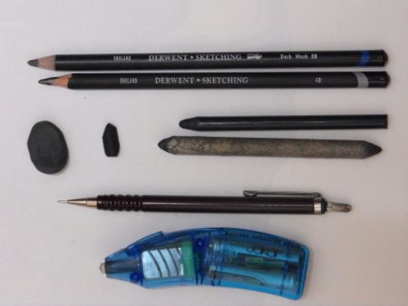
Pencil Portrait Drawing Equipment
HB 0.5 mechanical pencil, 3B graphite dust, a charcoal pencil, Jakar battery eraser, A3 300gsm water color paper, chalk pastel,Derwent 4B sketching pencil,paper stump, Derwent 8B dark wash pencil.

I succeeded in capturing the essence of Kurt Cobain and also managed to only suggest many strong features like the hair, creating a graphite pencil portrait drawing with photo realistic elements and also bold suggestive pencil marks. I am happy with the outcome as it now presents a better understanding of the 3 dimensional shape of the face giving me the possibility of further exploration and experimentation.

But…

My next victim will be, His Bobness.

Bob Dylan deserves to be immortalized in a graphite pencil portrait drawing if only for the fact that he has been on a never ending tour for possibly the last 50 years of his life, intentional or not that is a feat of endurance and lasting commitment.

View Gareth Pritchard’s profile on G+


Make your own graffiti art easy.

Make your own graffiti art because it’s not as difficult, as you might think, it only takes, a basic knowledge and some practice. There are numerous styles of graffiti, but the most common factors are as follows.

  • They are painted in strong vibrant colors, that often clash.
  • They are intended to be attention grabbing.
  • They are often emotive concepts, that question the norm.
  • They often contain 3D lettering.
  • They often contain lettering that overlaps.

The heavy bold 3D lettering is very apparent, in the majority of graffiti art images and is usually the starting point, for most potential artists, as it most often starts with your name, tag or handle. Many of the same, distinctive, bold style lettering’s, used in advertising to create impact, are also used by the graffiti artist, so are a good place to look, for ideas. It most often reflects and resembles, the branding or advertising art world, in many ways but chiefly as a counter alternative, usually with a strong, social, political massage, that the artist is passionate about.

  • The pictures or pieces of work themselves, will contain sharp hard hitting  contrasts.
  • They will be painted in stark vivid colors.
  • They will be well defined, with strong shadows and outlines.

The best way to start, your piece of graffiti art, is by drawing smaller ideas and outlines, that you can later scale, up to any size, this will help you to understand, the problems you might face, when attempting to create something bigger. Scaling your ideas, is a simple task, once you have a smaller drawing or painting to work from. There is an endless supply of ideas online, if you need them, for fonts to use in your graffiti, as well as examples of graffiti, created by others to feast your eyes upon and incorporate into your own work.

The tools to use for your designs or ideas are, pencils, felt tipped or marker pens and fine line drawing pens, all of these come in a very wide range of distinctive and vivid colors, that make them an ideal choice, for graffiti artists.  If you need ideas for a graffiti font to use, there are plenty of sites online, that have examples for you to copy.

Outlines can be created with a graphite pencil and or any permanent black ink pen but fine line and wide chisel or bullet tipped markers, are a preferred choice of many. Shading around the letters you’ve outlined, with a range of different colors will enhance the 3D effects of your lettering, to make it more distinctive.

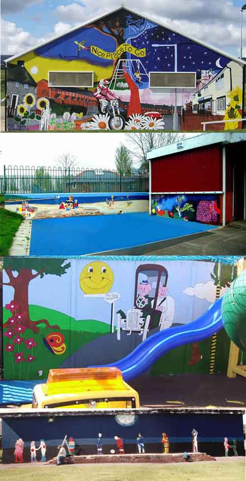
Make your own graffiti art because it is really easy, if you use these methods and it is not as difficult, as you might think.Make your own graffiti art, Images of Brynteg, Caia Park Nursery, Gate Hangs High, Chester, Blacon YPP murals on buildings and an installation piece at Caia Park Nursery.

Make your own graffiti art, Images of Brynteg,  Caia Park Nursery,  Gate Hangs High,  Chester,  Blacon YPP murals on buildings and an installation piece at Caia Park Nursery.

Yes I know, that there are many who would not consider this graffiti but I say “make money not trouble”.

When you are ready, to paint your outline drawings and ideas onto canvases or bigger surfaces, you can use the grid reference method, by marking out a grid over the top of the drawing, you want to enlarge. You then recreate this grid onto the area, where you want to redraw, your original drawing and then use it to measure, where everything goes by comparing grids. Very large areas can be marked out with string, by impregnating it with chalk or charcoal, simply by rubbing it into the fibers, when the string is in this condition, you stretch it out tightly, across the area that you want to mark out. Then you pull it out from the middle and let it go, so it then snaps back against the surface of the new drawing area, leaving a mark imprinted on to it.

You can then use the chalk or charcoal to redraw, the outlines onto your new drawing area. Spray paint the main outlines, with a similar color to the background but a couple of shades lighter or darker, so it will cover more easily if you need to change anything later, allow this to dry before continuing.

Then you can begin to fill in the details and your areas of color, with spray paint in much the same way, by starting with the lightest colors first and the largest areas, then putting in the details. Finally you can carefully fill out the black outlines, with your spray paints, adding highlights and finishing touches at the same time, you can even use a brush, to do your very fine details. Once again let me say make your own graffiti art because it’s not, as difficult as you might think, it is really easy, if you use these methods.

View Gareth Pritchard’s profile on G+
 

Drawing lines or line drawing what?

Drawing lines, is not quite as simple, as you might think because the weight and thickness, of the lines we make, have an impact, on the effectiveness of our drawings, to add to this, is the hardness of the line, which I will explain later, is also of importance.

The meaning to thickness of line, should in essence be obvious, it means what it says, how wide or narrow, the line actually is, has an impact, on how our brain, relates to that line in context, of what is surrounding it and the tonal value of the line, also has an impact, on what is seen, when I say tonal value, I am talking about how light or dark, the line is in tone.

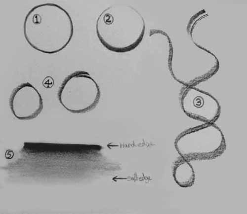
If you draw a circle, with a wider, darker line along the bottom area, it will look like it is, the bottom of a sphere and will start to look like, a ball shape, rather than, simply just, looking like a circle. This also gives, the bottom half of the circle or sphere more weight because the wider line, is more substantial, especially, if it is also darker in tone, it will attract the eye, giving more emphasis and importance, to it, this also creates the illusion, of light and shadow, that is often used, to emphasize, the under areas of shapes, we draw, suggesting, the shape, is three dimensional.

Please take a look, at the drawings, of the two circles, 1 & 2 below, to see an example of what I am trying to explain, also take a look at, 3 & 4, these lines and circles, have been made with a 5 mm, a half cm, flat pencil, notice how the line varies in width, giving it the look of a twisted ribbon. Number 5, shows, how lines can go, from a hard, definite edge, to a more subtle, less definite edge, that can be used to great effect, in your line drawings.  These different types of line, can be used to create light and shadow, so as to suggest the illusion of form and shape but still maintaining, the quality of being a line, using this, within your line drawing, can start to bring, your line drawings, to life.


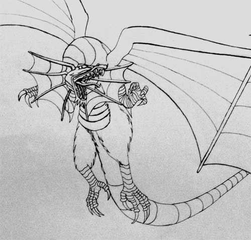
Image of different line types numbered to help.The dragon drawing below, was created with pen and ink, it puts very little emphasis on line quality, it is a line that is consistent, in thickness, giving little or no quality, other than just being a line but even so, it does create the image of a dragon, through the use of drawing lines, with nothing more.

Quick bsic drawing of dragon outline.

To find cool drawings.

Cool drawings are not as easy to find, as you might think because your version of cool, is almost certainly not my version of what is cool, anymore than the next person because it is a matter of taste and you might find that, some of the people can be pleased, some of the time but not all of them, all of the time, labels such as cool are subjective, so they are as individual as the individuals themselves.

I have already established, that it is highly unlikely that, what I find cool, you will also but I can still help you find cool pictures, by giving you some ideas about the ways that I use.

If I know what I am looking for I do searches on Google Images, this is the quickest way I know for finding a picture or drawing, I am looking for because in case you did not know, you can search using key words, the same way you do when you are searching for anything else online, there is one down side to this and that is, although it is much easier nowadays, than it would have been ten years ago, it is still time consuming and laborious. Sometimes you have to literally look through hundreds and hundreds of them, because there are so many.

The pretty pink pain killer image.

You can also do searches on other sites, like Flickr or Flixya but there are too many photo management sites to mention them all, these sites store millions of indexed images, belonging to other people, pictures they have submitted. Some of these types of sites, actually pay you a small fee if others, want to use the ones that you have submitted. They all have rules about this but these are usually quite liberal and open minded, yet still quite tasteful or respectable because they have to try to please all.

One of the best ways to find cool drawings or pictures, that I especially like because of the way it works is a free online tool, called Stumble Upon.

It works like this, you join Stumble Upon by submitting your details, to become a member, then you select topics of interest, the more you pick the more variety you will see but these will not all be pictures, unless you clicked on the tool bar to select just images. The great part about it is this, you click a button to be presented with random pages of interest, if you set it to images then you will just Stumble Upon random pictures, covering any topic.

Now because the best usually climb to the top, through popularity in this program, then you get presented with the most popular, so they are usually very good but also besides this, they are random, so you do not have control and are presented with images, that also surprise you, giving you some great random subjects, that often stimulate your own ideas, for creations to work on.

I find Stumble Upon a great tool for giving me new ideas, when I don’t have any but also very entertaining, with it’s rich variety of cool drawings and pictures, also a great place to put your own work on too.

Two Point Perspective.

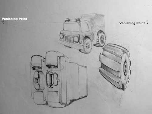
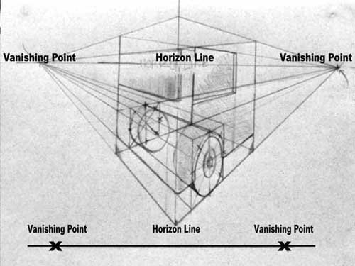
The two point perspective or linear perspective, as it can also be called, is a construction drawing technique that is made up of vanishing points, which are the points placed along an eye line or horizon line, as it is some times called, these are the elements that make up perspective drawings, like the ones below. Although the first drawing is quite nice, it is just made up of simple straight lines and curves, using a straight edge or line rule to place the guide lines from the vanishing points, it is much easier to draw perspective, when using these techniques.

As can be seen in the drawings below, the horizon line or eye line, is just a horizontal line drawn across the page, to represent where the horizon would be or the place your eyes would be level with, when you are looking at some thing, by drawing all subjects in relation to this line, it creates the effect of there being distance in the image and between the object in it.

In the drawing below you can see the horizon line, vanishing points, construction box and perspective lines, that make up the 2 point perspective much easier and should assist you, in understanding how perspective drawing works. The vanishing points create the points where an object would taper off into the distance, to create the impression of something being three dimensional and this technique is sometimes called, true perspective as well as linear and two point perspective.

The horizon line and vanishing points are used to construct boxes, to use as guides and enable you to draw an object that looks like, objects in life that taper off into the distance, the best way to see this is by looking down a long street, where you can see the building close by above your head but the further into the distance, they go the smaller the further away they become and the road also gets smaller, another example can be seen on railway lines, when you look at them, they seem to meet in the far off distance.

Image of two point perspective drawing.
Image of two point perspective drawing of a child’s toy.


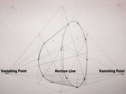
In the image below, I have drawn a wheel type shape in a box, to show how the same effect can be created with circular objects like wheels but I have also used, a very low horizon line, to give the impression of looking up at something, making it seem very big and above your head, even though it is just a simple drawing on piece of paper. There are lots of ideas you can create when you draw perspective and these types of drawings, always look dynamic, giving a great deal of impact to any drawing, so it is well worth experimenting with this 2 point perspective technique.

A two point persective cube image.
The horizon line has two points from which to draw perspective in this example.
Image of a big perspective
A big perspective with a low horizon line giving the impression of looking up.

The horizon line has two points from which to draw perspective, in the above example.

A big perspective with a low horizon line, giving the impression of looking up at something, can be very impressive, expressing an image of power and dominance.

You can do this with a single, one point perspective or two point perspective, as well but the single point is a little limited because it often only works well, when looking at something directly from the front.

Modern mark making, in the context of drawing, a point of view.

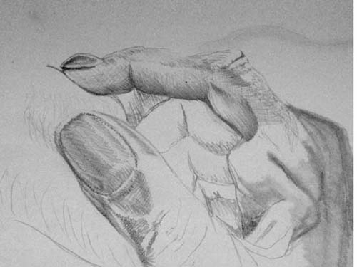
I took the charcoal drawing of a 1967, Austin Healey, 3000 Mk III, sports car and super imposed it into another image of a thumb and finger, using GIMP photo editing software, I fused them together to compose the image below, about understanding perspectives and using mark making, as a visual dynamic for tricking the eye.

Pencil drawing photo image of a thumb and finger.In the drawing above you will see two different pencil techniques, one is called hatching and the other is called tonal modeling, both are used often, as drawing techniques for different reasons mostly. The hatching or also called cross hatching technique, is often used to draw subjects, that lend themselves to that type of mark making, like hair, grass and other textures, that can be described with lots of little lines or dashes going all in one direction or differing directions, and is a natural way to use a pencil.

The other technique is tonal modeling, which is where the pencil is smudged or modeled using graded tones, to create soft edges and shadows, most often seen in the drawing of skin tone, and clouds but in the drawing above, you will notice that both are being used in the same drawing.

The finger and thumb of the hand is drawn using hatching and cross hatching, whereas the back of the hand is drawn using a tonal modeling technique. The example is used to show how these techniques, can be used in this way and although they lend themselves to best describe textures that have been mentioned, they can also be used effectively to describe textures, that would not really lend themselves to these techniques, like with the finger and thumb.

This is also an example of how you can take already existing drawings and with photo editing software, fuse them together as a means of generating new ideas, bringing very different tools together to aid the creative process.

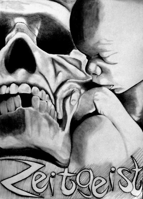
The image below, is almost completely created using tonal modeling and is a example of use, where it would accurately describe the fleshy textures of the baby’s skin tones, as well as, the bone textures of the skull, with the only hatching type marks, being around the word zeitgeist, which are again smudged pencil lines, with slightly modeled edges, that are not sharp or well defined. Mark making is also found in painting as well as drawing and is an important part of all kinds of art, where sometimes they are not lines, dashes or modeled areas but can be splashes, scribbles or pointillist type marks.

Zeitgeist, spirit of the times, pencil drawing.
The Zeitgeist, is the spirit of the times, this is a pencil drawing of life and death, called Zeitgeist .

A hand and the artificial creations, born from its great ability, to manipulate the world around it, isn’t all intelligence artificial because we only think we know, when we recognize the mark making?

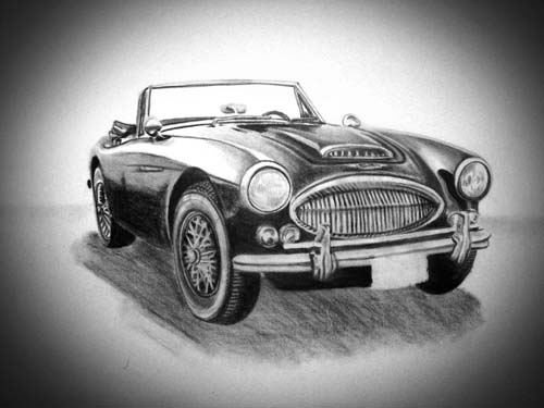
Charcoal drawing of a 1967, Austin Healey

This is a charcoal drawing of a 1967 Austin Healey, 3000 Mk III, it was my first attempt at drawing a car using charcoal. The fact is it was my first attempt at using a charcoal pencil. Most of my work up until this point when using charcoal, was much bigger drawings and mostly life drawings. Charcoal drawings are good to draw because you can get very good tonal definition. Although the charcoal does not give you the same subtle tonal variation, you can get with a graphite pencil. This is mainly because it is usually very black or dark brown, almost black, where as graphite is grey but never quite reaches a black.

1967 Austin Healey 3000 Mk III charcoal drawing.

The other issue with graphite is the darker, the tones and thicker the layers of graphite are the reflective they are. This makes them seem lighter than the they actually are, at different angles because of the reflected light. Charcoal does not present this issue, as it is courser, producing little or no reflective qualities. Another issue with charcoal is, it is difficult to make very fine precise lines, partly because the material it’s self is quite soft and powdery. This issue can be improved considerably with compressed, harder charcoal or some harder charcoal pencils which I did not have when doing this drawing. The wheel spokes and some of the fine chrome details, would have benefited greatly from having some hard compressed charcoal pencils, when doing this drawing.

Charcoal drawing-size can be an issue.

The car was drawn onto A3, 300gsm watercolor paper, using the smooth side of the paper, the quality of the paper was not a problem but the size was. It would have been better if it was draw on A2 sized paper. This would have given me a bigger drawing area, so that the fine detail would not have needed to be so small. It would have reduced the need for very fine detailed lines.

The 1967 Austin Healey 3000 Mk III, charcoal drawing above, was drawn onto A3 water color paper, also with a little photo editing in this image, using PC software. This amounts to amounts to the darker faded area around the car being added. This gives the impression of it being under a spot light.

Charcoal drawing-better detail with marker pens.

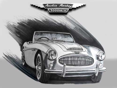
The Austin Healey, 3000 Mk III, drawing below is not a charcoal drawing or graphite pencil drawing. It has been created with various grey marker pens. Slightly larger in size at A2, on 180gsm cartridge paper, it looks better because of it. There are no reflections of light from the marker pens but they have very nice tonal variations, with nice fine details. The issue with marker pens is that they tend to bleed through the paper. This makes the lines thicker than intended but because this was drawn on A2 paper, it compensated for the issue. The marker pens produced a nice drawing, that I was pleased with at the time. There are a few minor issues with it now, after reflecting on it but over all, it is a nice drawing that I am still pleased with.

Austin Healey 3000 MKIII Marker Pen Drawing
Austin Healey 3000 MKIII, this drawing is another example of the car but it was drawn with marker pens and not a charcoal drawing like the one above it.

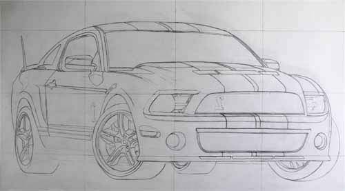
The grid drawing below is of a Ford Mustang Shelby, GT 500, in graphite pencil. It was used as a construction drawing and was later was filled in using marker pens. It shows how neat and more precise the lines can be using a graphite pencil. It can be compared with the first drawing using charcoal.  The final drawing made from this also turned out well when finished in marker pens.

The  point to remember when when drawing, is size, it is much easier to draw a very fine detailed drawing, when doing it on a large drawing area, than it is when drawing in a small area, so size dose matter and large drawings will also look very impressive, to the onlooker.  If you are going to draw a charcoal drawing of a 1967, Austin Healey or any car with fine detail, then you will be best remembering, that bigger is better, size matters.