Julian Beever sidewalk art and pavement chalk artist is now very well known on line. Over the past 6 or 7 years he has grown to become a very popular figure of discussion, which is because of his excellent 3d drawings having gained him widespread publicity, people sure like unusual subjects to discuss don’t they? In his work he creates the most amazing side-walk art by using anamorphic perspectives.
It could be said that he is an expert in the creation of dynamic optical illusions, with much experience in focal plane perspectives, this alone is to be admired, if not for any other reason than using anamorphic perspective and dynamic perspective to project himself across the world. Most of his work is celebrated by both people & businesses alike, having donated to this effort, allowing the opportunity for Julian’s work to exist. Once the work is completed it is abandoned, thus making it into what is called ephemeral art, an art form that has a short life span, something that eventually disappears like tears in rain.
Julian Beever Sidewalk art.
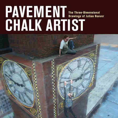
In his book (Pavement Chalk Artist) he proclaims himself to be an entertainer, a showman, who started as a juggler and become a community activist, celebrated on a global scale as well as also being a very competent draughtsperson. Maybe he has a BA degree acquired at Leeds Polytechnic under his belt but after that he certainly went his own way and set his mark on the world populace.
All I can say about him really, is street art.
Because Julian Beever sidewalk art is unusual it has drawn attention to him from people all over the world but he also uses the same tools as the media networks that publicize the creations and portray the work. Works that can only be seen at their best through the eye of a camera lens, the same camera lens that was used to draw them. Coincidence or not these are the same visual tools that are used in the media networks and the social media networks that are enjoying a bonanza online at the present, photos say so much and are so easy to share. Grab attention for yourself by creating unusual art, 3d drawings that you can give to the news and wider media to be shared using the same tools everybody uses, coincidence or not, it works.
Julian Beever sidewalk art, 3d paintings don’t seem that difficult when you know the methods used to create them so please let me tell you how.
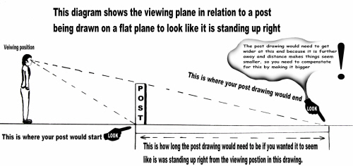
If you look at a pole or post that stands upright coming up from out of the ground, it will look like it is standing upright, it needn’t be a pole or a post, it can be anything, I use a post for explanation because it is a simple shape to use as an example.
Take a look at it from about 6 meters or 12 feet away, you will easily see the image as an item standing upright. You will see the post with all the differing angles that your brain will tell you is a post standing in an upright position from the ground. If you then draw a picture from the exact position you are standing in or take a picture from that position with a camera, it’ll look like it is a post standing in an upright position. If you then place that drawing, image or photo, flat on the ground it’ll look like a picture lying on the floor but it will never have the look of a post that is standing upright. It will not matter how big or small it is, not even if as large as the post itself, it’ll never really look like an upright post. If you move further back away from where it is lying on the floor, it’ll be increasingly difficult for you to identify what it is, as the angle which you’re looking at will make it more and more obscure. Julian Beever correctly refers to this angel as a viewing plane.
This is why it’ll not work.
When looking at 3D objects in reality our eyes see many different angles which are related to size, shape and distance, because you’ve 2 eyes, they see little differences and your brain informs you when the objects are 3-dimensional by understanding the meaning of all these different angels, it tells you that what you are seeing is 3 dimensional and has more than 1 side, which is what happens for you to see in 3D.
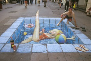
An example of this phenomenon can be seen in Julian Beever sidewalk art below, described as the swimming pool, in the High Street.
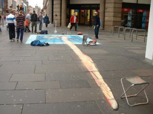
Below is the same Julian Beever sidewalk art example of a pool drawn on another high street from an opposite viewing position to show how these images are elongated in order to make up for the distance they are being viewed at and giving the illusion of them being closer than they actually are.
This helps the Julian Beever sidewalk art to achieve the illusion below by tricking the eye into thinking the focal length is shorter also enabling Julian to give the impression of a very small man on the top of a very large bottle.
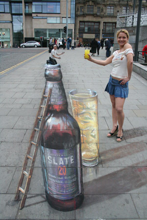
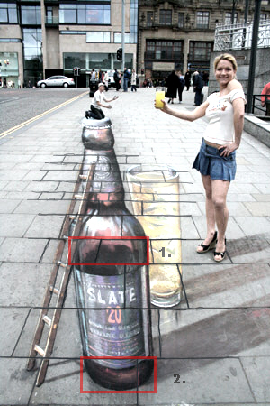
In the Julian Beever sidewalk art pictures above, I’ve highlighted the lines where the paving slabs join, so you are able to see more clearly that the top part of the bottle is much bigger than it should be in relation to the bottom to create the illusion of it being closer.See how the base of the bottle in highlighted section 2 is just a little bit less than the width of one paving slab but the middle section just before the neck begins to taper in, highlighted section 1 is almost 2 slabs wide and should help you to understand that the drawing is being distorted in order to help make up for the distance it is at.
The distance is best seen by looking at the Julian Beever sidewalk art example aboveto see how small he is when compared with the girl and looking at the gradual reduction of the size of the tiles, they can also be used to help to measure out and map the construction of your drawing like using a grid. The top part of the drawing looks like it is about two tile’s wide and much larger than the base of the bottle in the drawing.
Trying to understand how Julian Beever sidewalk art works.
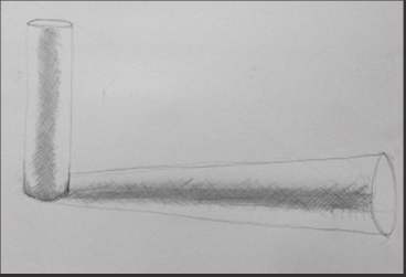
When doing a drawing of a post so that it gives the impression of it standing upright, it would have to be elongated so as to confuse your eyes and brain into thinking it was closer to you than it actually is. It would also have to be much wider at the top to compensate for the distance and the further away it is the wider it would have to be because something further away gets smaller, meaning you will need to make adjustments to it in order to be able to compensate for the distance. Doing this in the drawing will give the illusion of it being closer than it is in reality. The Julian Beever sidewalk art incorporates these measures into the drawings to make them more believable and 3D looking.
A bit like the picture below, where the horizontal drawing is much larger at the other end from the base because it is farther away so it is drawn bigger making it look like it is closer.
Julian Beever sidewalk art.
Below is yet another example showing Julian Beever sidewalk art that shows the image as being elongated so that it will work from the distance in which it is being viewed.
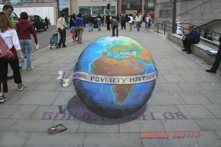
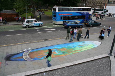
The image above of the world picture shows another example of stretching the drawing and how the drawn image becomes much bigger as a means of compensating for distance Please take a look at the Julian Beever sidewalk art video below.
Below, I’m told this is a different type of drawing that has been attributed as being more Julian Beever, sidewalk art in the form of being a more traditional mural on a wall, it’d not surprise me as it is somewhat in a similar style that is reminiscent of other drawings he has composed. If this is not one of his drawings then it would be safe to assume that there has been some influence from Julian Beever sidewalk art in this work and I’d be very surprised to find it hasn’t. I like it as it’s very dynamic and impressive.
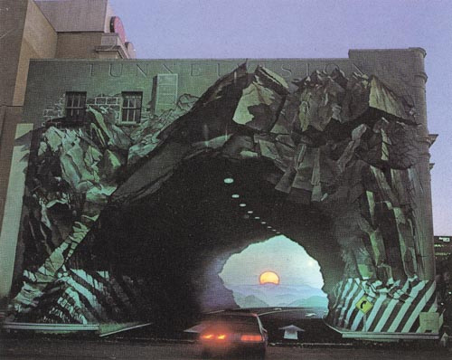
It turns out that the above image was not by Julian Beveer and may have even been an insperation to him and not the other way round because this work was unveiled in 1975
It is fifty foot by seventy five foot mural titled TUNNELVISION by artist, Blue Sky.
More information and work by the artist can be found here at this link.
Blue Sky Gallery The online art gallery for Columbia, South Carolina’s premier artist, Blue Sky.
Julian Beever sidewalk art, chalk art can be seen in his book (Pavement Chalk Artist) 2010 is full of wonderful insights about his work giving you a small insight into the mind of the artist himself and how he created this popular street art, I bought mine from here and it was worth every penny better than any ebook online.
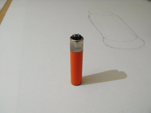
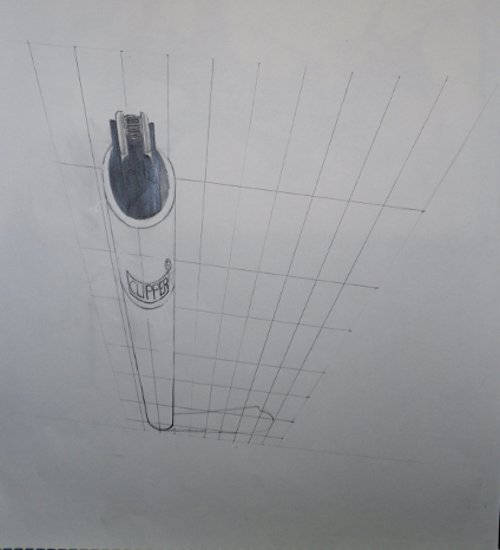
The challenge is to draw this lighter as an Anamorphic Perspective and reveal how it is done for those who are interested in finding out.
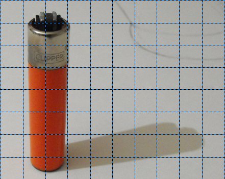
I took the lighter image and inserted a grid over the top to use as a reference grid for doing the drawing, I also want to show what the Anamorphic Perspective Grid actually looks like.
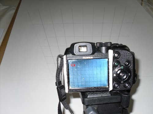
My camera was set up so I could draw the grid by using a camera as a viewer so as to be more able to draw the grid by using the viewing window of the camera as a guide. This is the same position and angle that the original lighter photograph was taken at.

In the image below you can see both the grid that has been drawn onto the A1 sheet of cartridge paper and the image as seen through the camera lens. It shows the difference between the real drawing on the paper and the image being viewed through the lens and you can see that the image in the camera viewer is now symmetrical. This now enables me to copy the image from the lighter standing in upright position with reference grid over the top as above.
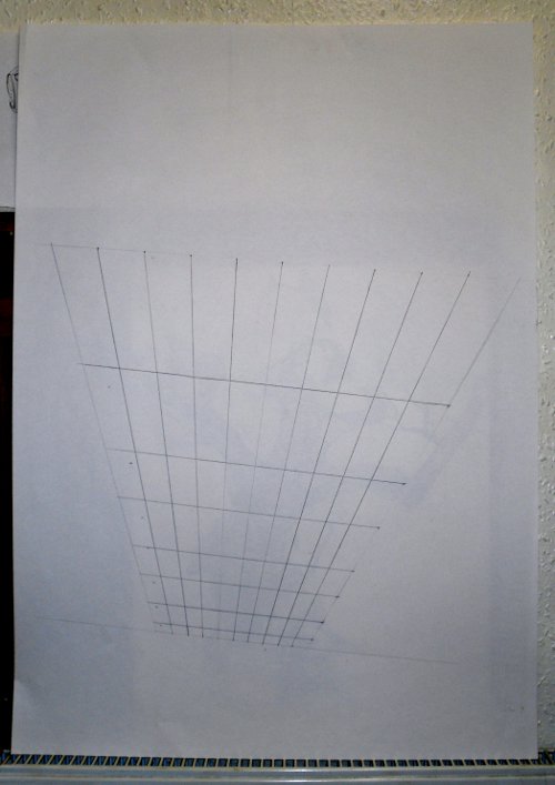
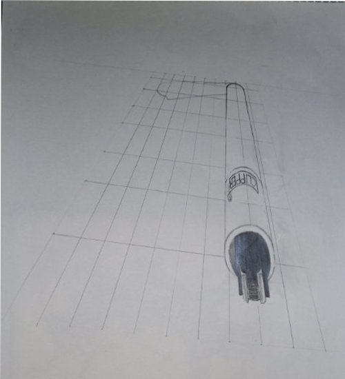
The image below shows what the Anamorphic Perspective Drawing Grid looks like when viewed directly from the front and looks like a normal perspective drawing grid that would perhaps be used for drawing a building looking down from the top.
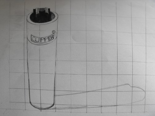
This is my quick drawing of the lighter when viewed from the correct position with the camera as you can see it worked and the lighter actually looks like it is standing upright.
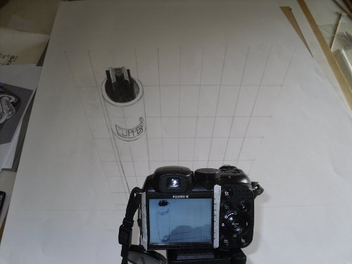
When you look at the image below it helps to get a look at it in its natural state as a flat drawing on a flat surface and help to get an understanding of how the Anamorphic Perspective works.
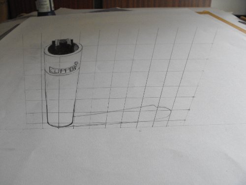
Below is the drawing completely in its natural viewing state as it can be seen directly from the front and now you can see how distorted it actually is. It is now quite easy to draw an Anamorphic Perspective grid because it is in actual fact a normal perspective drawing grid being looked at from upside down.
Julian Beever sidewalk art, chalk artist his work can be seen in this book (Pavement Chalk Artist) 2010 it is a full colour book of some of his work giving some wonderful insights about how he came to create this popular street art. I enjoyed reading this book and gaining the small insights into the thinking of the artist himself, it was bought from Amazon and it was worth every penny better than any ebook down loaded from off line, I prefer the real thing.
Click the image below to get a price on Amazon.
Julian Beever sidewalk art, chalk artist.
View Gareth Pritchard’s profile on G+


