Tag Archives: Illusion

3d drawings, anamorphic secrets revealed.

3d drawing secrets.

The secrets of anamorphic 3d drawing and the amazing 3d drawings of street artists are no longer a secret any more. Follow the information contained on this page to reveal how it can be understood using a reference grid.

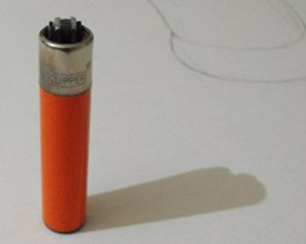
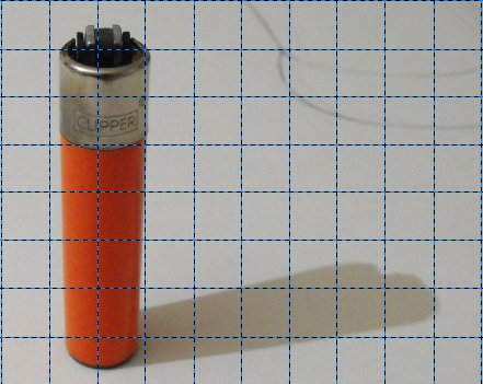
The video below shows a clipper lighter standing upright, nothing unusual or outstanding about that. The problem for many people, is to understand how it can be drawn to look like it is standing upright on flat 2d piece of paper. The secret of 3d drawings used by street artists that you need to know, is how to create the anamorphic illusion. If you know how to do this then it is not a problem. This is for those who do not know and would like a better understanding of this illusion.

Please see the video below to see this in action.

An example of a Clipper Lighter standing upright to be used for our 3d drawings.
A Clipper lighter standing upright to be used as an example.

3d drawings using a camera.

Most street artists when creating these anamorphic 3d drawings use a camera to aid the process and describe their technique as drawing by eye. This means they are drawing by looking and using the camera as a guide for doing so.
GIMPed pumpkin head.
Don’t be a pumpkin head get GIMPed.

In the image below a grid for reference has been drawn over the top of the lighter image and it has been cropped using the free GIMP photo editing software. Many artists use reference grids for getting their construction drawing accurately draw. This can be easily done using a pencil and straight edged ruler. If you don’t have access to photo editing software you can do it by using a print out of the image.

Clipper lighter with grid for taking 3d drawings from.
Clipper lighter with reference grid placed over the top for aiding our 3d drawings.

Using a camera viewing window to do 3d drawings.

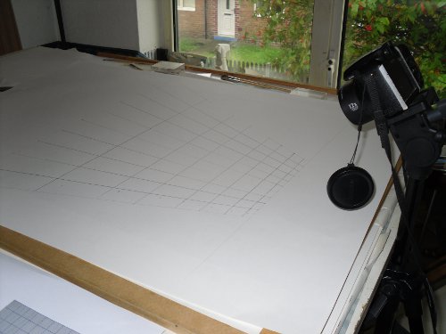
The grid was drawn onto a piece of A1 cartridge paper to replicate the grid in the image above but as can be seen in the actual drawing, the grid drawing is far different from what can be seen through the camera lens. Notice that the grid drawing gets wider and wider, the further away it is from the camera. This is because of distance, indicting that the further away the object is, the bigger it needs to be in order to compensate for that distance.

The secret to these 3d drawings is realizing that this is what makes the technique work, being able to compensate for distance.

View of the camera in position and 3d drawing grid.
View revealing the position in relation to the camera of the drawing area and 3d drawing grid

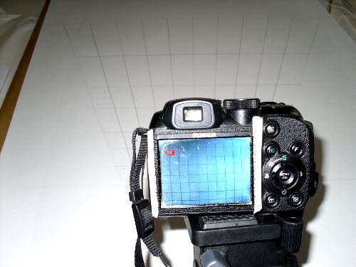
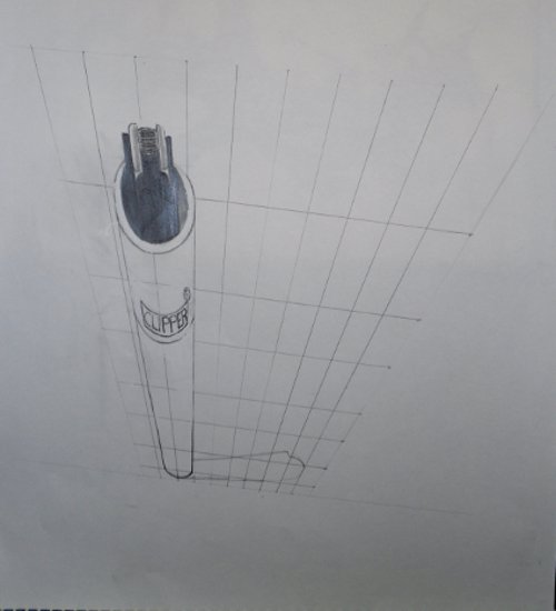
Below is an image of the camera showing both the drawing of the grid and the image, as seen through the camera lens, showing the difference between both. In the camera viewing window the grid looks like it is made up of squares. Where as the actual drawing isn’t made up of squares at all. This enables us to see how the camera lens at this viewing plane is distorting the drawing. Thus making it seem like it is made up of squares, when it is not. It is actually the same as any other perspective grid used to draw 3d drawings, that would be drawn to depict an object as if being looked at from the top. With the bottom tapering off into the distance as will be shown the the next image below this.

View of the reference grid drawing and what it looks like through the camera lens.
This image shows a view of the reference grid drawing and what it looks like when looking through the camera lens

Notice the two strips of masking tape placed down each side of the camera viewing window on the camera. These have been marked out with with lines equal in measurement. Using these measurements down the side of the viewing window of the camera, helped me to draw the grid. Using them as guides to see where to put the marks on the papers drawing surface. This was only necessary for the horizontal lines of the grid. The vertical lines can be measured after you have drawn the horizontal lines. This can be done by dividing the top and bottom lines by ten as in this example but this will depend on how many squares you want in your 3d drawing grid. The more squares you have in your grid to make 3d drawings. The easier it will be to complete your end drawing.

The secret of 3d drawings using a camera technique like the preferred choice of street artists.

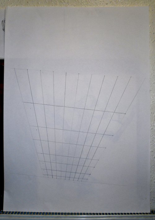
In the image below you can see what the reference grid actually looks like when viewed from the front as you would normally. Please take notice of how the grid is wider at the top than the bottom. Also notice how the squares have become elongated and the horizontal lines are further apart as they get closer to the top of the paper. This image below shows what a perspective 3d drawing grid might look like if it was being used to draw an object, such as a building being viewed from above.

Anamorphic perspective grid for doing 3d drawings.
Anamorphic perspective grid for doing 3d drawings viewed directly from the front.

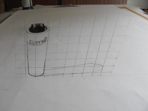
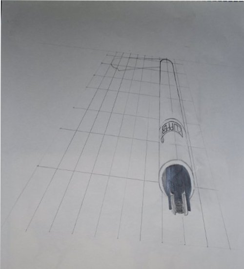
In the next image below I have drawn the Clipper lighter using the perspective grid for 3d drawings as a guide to accurately draw the lighter at this distorted perspective. Also notice how it can be seen in the camera viewing window. Notice how when looking at it through the camera viewing window it can be seen as a Clipper lighter standing up right and how the drawing grid also seems to be made up of squares.

3D Drawing Through Camera Lens Showing Lighter And Grid Showing Visual Plane.
3d drawing of the lighter through the camera lens, this is showing the lighter and reference grid at the correct viewing plane for comparison .

The image below is a photograph of the 3d drawing, showing further how it looks just like any other drawing of a lighter standing upright. This gives you a visual demonstration of the optical illusion created by the anamorphic 3d drawings perspective and the focal plane of the camera.

3d drawing of the anamorphic perspective grid and Lighter
Anamorphic perspective drawing at the correct photographic angle and position as photographed with the camera.

The next image has been photographed slightly out of position and not at the correct focal plane. This enables you to be more able to see what it looks like in reality. It is revealing the distorted 3d drawing showing how it is much bigger at its furthest point from the viewing position.

Anamorphic Perspective Grid Drawing Not Sited with Camara Corectly.
Anamorphic Perspective drawing lying on drawing table showing its two dimensional attributes because the camera is not correctly sited.

Below you will find two more images to show what this drawing really looks like, when viewed as you would normally, the first one is the right way round and the second is being viewed, the wrong way round. Taking a look at these gives a better understanding of what the secret really looks like and helped me to visualize the distortion created by this unusual illusionary effect in the technique of making 3d drawings.

This image below is being shown the correct way up and is viewed from the front as you would any other drawing or image, directly from the front. It clearly shows how the drawing is distorted with the top being much wider than the bottom.

3d anamorphic perspective drawing with camera not correctly sited.
The 3d drawing of the lighter as viewed directly from the front showing it as it would be viewed when not looking at the correct angle.

The image below has been turned up side down and reveals that looking at it this way around presents an image that resembles a perspective grid for depicting something that is tapering off into the distance. This is because that is what it is and would be doing. If something is close it will be big and as it gets further away it will get smaller, and smaller, the further into the distance it gets.

3d Anamorphic Perspective lighter Drawing Upside Down From the front.
The same 3d Anamorphic drawing from the front but turned upside down it gives the impression of any normal perspective drawing, creating the illusion of distance.

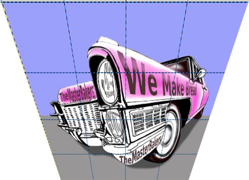
These 3d drawings can be created on a computer using GIMP photo editing software or any other photo editing software if you can distort images with a perspective tool. I found that if I took an image and placed a reference grid over the top of it on a separate layer in GIMP. Then merged both layers together and distorted it with the bottom being half as wide as the top, it created a good example of a drawing grid and picture combined. It produced an image that could be viewed with a camera to make it look like a normal image as shown in the example below.

Cadillac 3d drawing viewed through the camera lens.
Cadillac distorted 3d drawing, viewed through the camera lens at the correct visual plane.

It can easily be traced from an A4 sheet of printing paper.

3d Cadillac Drawing Distorted Image.
This image could be used for tracing as the outline for drawing a 3d anamorphic perspective

This image below is the actual photograph of the distorted image taken with the camera it is the result of this photo manipulation technique to create 3d drawing on the computer for close up viewing with a camera.

Cadillac Image taken with a camera of the distorted image above
Cadillac Image taken with a camera of the distorted image above, to show as an example

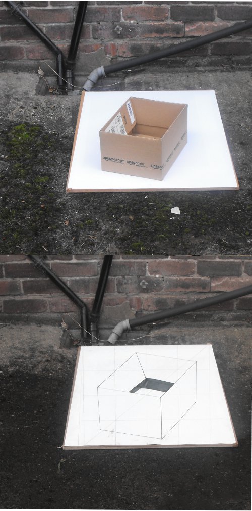
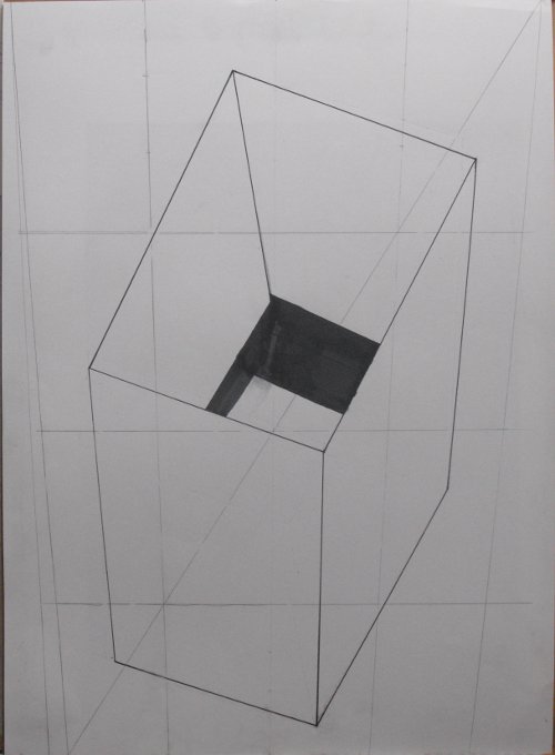
Then there are some images below this, with shots taken at a distance of about 10 feet, 3meters, of a box placed on a sheet of A1 cartridge paper. This is more closer to the working distance experienced by street artists doing, 3d drawings on the street.

3d drawing and box comparison.
3d drawing of box in comparison to the original photograph of the box in the correct position.
Image of 3d drawing of box.
The actual 3d drawing of the box when viewed from the front and showing the reference grid lines.

http://en.wikipedia.org/wiki/Anamorphosis

View Gareth Pritchard’s profile on G+


Negative space, positive space, line art.

Negative space might sound like a science fiction phenomenon, a Doctor Who concept or something from Hitch Hikers Guide to The Galaxy but to be totally honest it’s not.

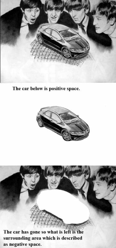
Negative space is the concept of space surrounding an object, if you where to draw a car, then that car would be positive space but the surrounding area around it, would be negative space.

As you can see below the surrounding area, known as the negative space, still depicts the outline of the car and can be just about recognized as a car, making this an example of how negative space can be used to depict an image, that is not actually there.

The example below will help you understand this better, I am sure.

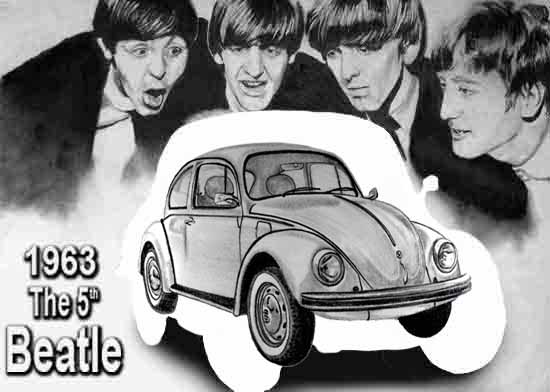
3 part Image depicting the famous Beatles and a Honda Civic in positive, negative space.
Beatles and a Honda Civic,  positive,  negative space what is it?

The space around an object, is important and deserves consideration, as it can be used to suggest objects, when they are not even there, saving you a lot of time because they are only used as outlines, saving you the time of rendering the detail.

MC Escher provides, probably the most celebrated examples of how negative space can be used, to great effect and below is an adaptation of his ideas, for illustrative purposes but best seen in his own work.

MY_flying_geese_Birds_Fish
An example, a version of flying geese, birds and fish taken from work by MC Escher.

The image above taken from Day and Night 1938, with the original being made from a woodcut print in black and grey, printed from 2 blocks and another image Sky and Water II, which is another woodcut of the same time, both mashed together.

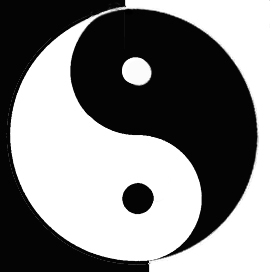
These are just two pieces of work from a vast collection of work by MC Escher, that convey the use of both positive and negative space, the same image in both spaces creating a clever illusion, which can be seen in many other examples like, the Chinese, Yin and Yang, which is another very popular example.

Yin and Yang classic Chinese Taoist Taijitu.

In its visual form, the Yin and Yang concept is conveyed as opposites, of equal size and proportion, where each contains some of the other, represented by the opposite neutral tones portrayed as, black and white dots in its opposite portion.

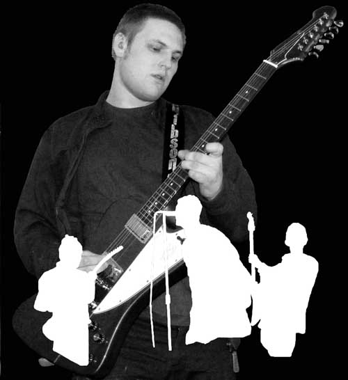
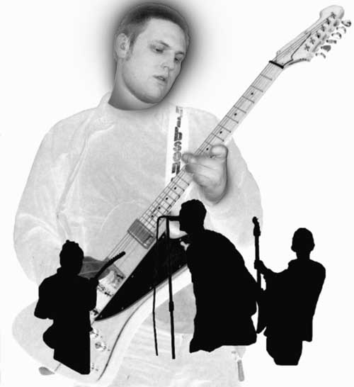
The use of negative space to convey, other double illusions, can be seen in the images below, where the use of simple outline cutouts, portray a similar image to the main figure, on the same theme of popular culture and music.

Guitarist and Oasis cut outs of band members.

The example above takes contemporary images, to convey them in both positive and negative space, through the use of outline cutouts.

Below is a further development, using outlines as silhouettes?

Guitarist Oasis cut outs reverse tone.

When drawing an outline of something, as like, when you are constructing a drawing, what you are trying to recreate is the line, between the positive and negative space, for this reason, it is important to be able to see that line, distinguishing the two.

The point where one stops and the other begins is the outline.

The Beatles and the 5th Beatle, negative, positive space.

The official MC Escher site: http://www.mcescher.com/ is a place to look if you would like to see, some of the very best examples of negative space illusion, as MC Escher was/is the grand master of optical illusion and negative space.

View Gareth Pritchard’s profile on G+
 

Outline drawing.

In the process of drawing images, we often start out with a basic outline drawing, as the foundation, for learning where everything else goes, in relation to the outline and each other. The problem I find with many beginners and well practiced people alike, is they do not always, understand outlines very well, also as in the case of beginners, they do not understand at all, in many instances.

The easiest way to draw and understand outlines, is by using tracing methods of drawing because when you trace an image, you can only, realistically make an outline, as tracing doesn’t lend it’s self to shading. Tracing also gives you a better understanding, of how pictures work, especially when trying to understand, construction drawing.

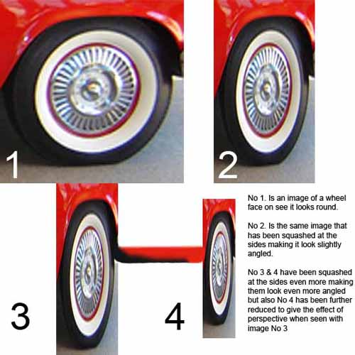
Wheel images showing perspective distortion.
Car wheel images showing distortion when seen in perspective.
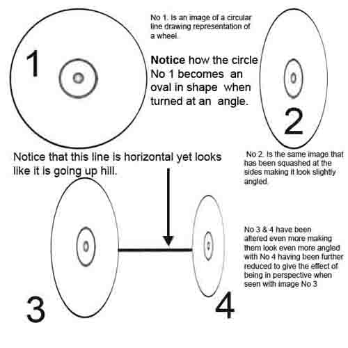
Wheel images showing perspective distortion line drawing.
Car wheel images showing perspective distortion in a line drawing format.

Let me explain, by using a car wheel as an example, we all know that wheels are round but they are only round, when we look at them directly face on, because when we turn them, at an angle, they become, more and more oval, in shape.

The correct term to call this oval shape, is an ellipse and is something many people have problems with, when trying to draw them accurately, to find out more about this, please take look at single point perspective and two point perspective, you will find the both helpful.

Get yourself some pictures that you might like to draw and trace them, so as to be able, to take a look at these images, as only line drawings, you will notice when tracing these outlines, that they are most often, not as you might have thought they are.

Doing this, will help you to understand, that shapes are not often, the shapes we think we see and that wheels, are most often not circular but oval, along with many other shapes we see but actually, only think we see. This is because our brains tell us that wheels are round or that a shape is this shape or that shape, when in actual fact, many shapes are not what we think they are because our brains are telling us what we see, rather than actually, seeing what we see.

Practice drawing human.

I hope that this will always be true but I also worry, about there being increasingly, less and less of the human elements, in our lives on a daily basis and at the same time, I embrace the machine for it’s ability, to deliver greater instantaneous gratification, when drawing human.

Can machines draw like a human, could this ever become a reality or is it already partly real because machines can be programmed, to copy every single human movement, with extremely fine precision, every single time.

So the one attribute, a human has over a machine, is we make mistakes and we are never going to be perfect but we are also good at hiding them or adapting them, for our purpose because after all, when drawing we are creating illusions anyway. To add to this, according to the esteemed Greek philosopher, Aristotle, art and science are created in the struggle for perfection. I will add to this and say in a perfect world, there would be no struggle for anything because it is perfect. Drawing is a struggling, to perfect the perfect illusion, where as all illusion is seemingly something it is not, so it is far from perfect. Perfection would serve no purpose anyway because it is the struggle for perfection and the lack of the same, that is the motivator of all action. Conflict is the motivator of the reaction and is the action, that drives further reaction, so perfection is the road to doom. In the struggle between order and chaos, one cannot exist without the other, in theory but within order, there is no chaos and chaos exists, with or without order, order is only a tool, with which to measure chaos. Chaos I believe is the engine of action or reaction, so therefore exists with or without order and it is the fact, that you can’t draw, that makes you human, which makes you good at drawing human, so remember that.

I am sick of hearing it said that drawing the human form is no easy task because in that context drawing anything is no easy task, when in fact I know full well, that drawing is easy, we all do it all the time but just don’t realize.

Lets get real about this, if you can move a drawing implement, around on a drawing surface and make marks with it, that is drawing. If you can make symbols, that look like other things, then bully for you because that’s not drawing. Drawing is being able to make marks, with a drawing implement on a surface, capable of retaining those marks, everything else is about being able to see and organize, those marks so they represent the symbols.

I hear people taking gobbledy gook and they can’t help it because it is wholeheartedly encouraged, by the arty farty brigade. You see the one thing all drawings are is illusions, one thing organized, to look like something else, which is an illusion, a trick or even a lie, what ever you think it is, it is not because it is an illusion.

Many, many people like to make out that drawing is this special, wonderful ability, that people are blessed with, well it might be true of some people but not me. God gave me a pencil and said there you go son, you can draw now, so then all I had to do, was organize the marks into illusions, I then spent my whole life organizing marks into illusions because hey, nobody’s perfect, and isn’t that the point.

Now if you want to get good at drawing human, then go away and make a few mistakes, it’s the only way to draw.
Nothing but the sun and the stars, graphite pencil drawing image.

Easy drawing an illusion of depth.

As can be seen in the previous post, (“Miki Falls”) manga creator Mark Crilley in his video (How to draw Manga backgrounds) shows, how it can be easy drawing the illusion of depth, by defining the fore ground objects with greater detail and color, than the background objects.

This technique is widely used by most artists to convey the impression of distance but is most often combined, with objects drawn in perspective, which is also covered in earlier posts. This is most often conveyed by putting objects into pictures, as triggers to convey this illusion and help lead the viewers eye, off into the distance along a line of ever decreasing reference points. Photographers use these very same techniques when taking landscape photographs by again placing larger or close up objects in the foreground to create the illusion of depth.

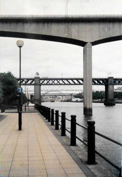
Below is a classic example of this, the photo image shows many parallel lines going off into the distance, with lines between the paving slabs on the ground, the lampposts decreasing in size as they go further into the distance. Then there is the railing along the edge of the water and also the bridges, with first one filling more than half of the picture, with the second only filling about one sixth and the third, being only about one tenth. All this information draws the eye along the lines towards the point, where they converge creating the illusion of distance because remember that this is really, only a flat 2 dimensional image.

Image of bridges in Newcastle, England, UK.
Image of bridges in Newcastle, England, UK, shown as an example of elements that create distance.

Also you should notice how the objects and bridges in the distance are only vague, as they are far less defined than the foreground railing posts, paving slabs and lampposts.

Photographs are a good example of how, these same easy drawing techniques, when applied to constructing backgrounds, create a sense of distance, this can be used to trick the eye into seeing the illusion of depth, without it really being there.

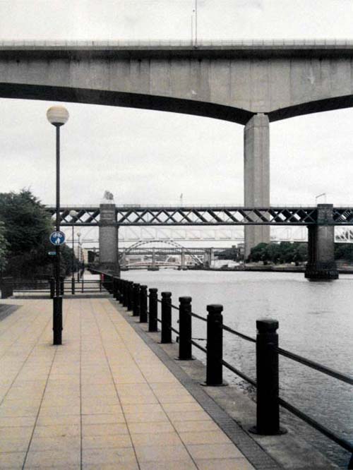
The image below shows how pictures can be changed by moving the order of objects, you will see what I mean by looking at the picture.

Image of bridges in Newcastle Upon Tyne, England, UK that has been edited.
Image of bridges in Newcastle Upon Tyne, England, UK that has been edited to show how moving things around can change their perceived distance and size. Do you think that the concrete bridge that was in the fore ground now actually looks bigger because the upright pillar has been pushed back in the distance?

How to draw easy, creating depth.

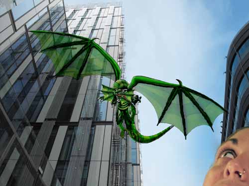
In the image below, is an example of how creating depth in a picture can be done, even when looking up into the sky, the buildings create an illusion of depth through their linear structure of lines, converging to a point in the sky, drawing the eye up into the sky, like the perspective construction lines in a drawing, taking your eyes, leading them off into an imaginary distance. This combined with a close fore ground subject, helps the illusion become more believable, in this image there are really only four subjects creating the illusion, the face and building above it, the dragon and the building behind it, all creating a depth of field in the onlookers eye, which tends to be lead from the top middle to the bottom right hand corner and vice versa.

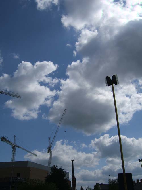
Dragon in the sky.In the image below, although the eye is lead up into the sky by the lamp post and the cranes to observe the big cloud filling most of the picture, the eye is the lead off as other clouds diminishing in size, lead off into the distance, creating the illusion of depth once again in this image, these are two examples of how perspectives, can be created even when looking into something as seemingly empty of structure, like the sky. It is interesting how other structures in the image can help to create the illusion of depth and even something as simple as clouds, can all help when they are reduced in size.

Distance and depth are created by using lines to lead the eye, the reduction of objects in size and making the objects seem further away, less well defined in detail, giving a further impression of distance in your pictures. Although these are not drawings as such, I used them because they give us some very good natural examples, of how distance and depth are created in the world around us, and how this can be utilized to create these illusions in our own drawings, if we think about them, for incorporating them into the drawings we do.


Distance in the sky.(”Miki Falls”) manga creator Mark Crilley shows us in one of his how to draw videos, Manga backgrounds, an interesting demonstration on, how you can be creating depth in your pictures and how it is achieved by placing an emphasis, on using color and line work to create the illusion of depth, controlling the definition of objects within your picture, making fore ground objects more defined than background objects.

Take a look it will be worth it.

Hatching, cross hatching and tonal modeling basics.

Hatching, cross hatching and tonal modeling basics, will help you understand shading techniques, this understanding I am going present will further enable you to develop your drawing skills, by using these simple methods.

A very basic explanation of tonal modeling is as follows.

If you draw on a piece of paper with a soft, 3B or 6B graphite pencil and make a dark line by pressing hard, then rub over the top of the pencil line, with your finger or with a piece of paper under your finger, you will see that line you made has now been smudged. Now the line that you made, will not be as well defined with the edges of it being softer and less definite or hard. This is known as a tonal modeling technique, one method of creating this tonal modeling technique is by smudging the pencil marks used for shading, to help create a more realistic three dimensional form. This is not the only way to do your tonal modeling or shading, as it can also be achieved by rubbing the pencil lightly over the paper to create a soft blended tone also.

There is also another shading method called hatching and cross hatching as well that we will explain a little later in this article.

Tonal modeling is when the pencil marks are modeled or smudged, so instead of them having hard edges, they have soft blended edges, this smudging can be done using your fingers, a paper stump, soft tissue or cotton wool. Using your fingers is not recommended because of the oils from your skin, that contain acids being left on the paper, these oils with time can cause discoloring and rotting of the paper, ruining the finished drawing, over a period of time.

When a sculptor models with clay, he creates the shape and form of the sculpture by modeling the clay with his hands, tonal modeling is when you model the pencil marks to create soft blended tones of graduated shading with a pencil, charcoal, pastel or paint, it is a process of blending tones or colors, so there is a soft graduated transition from one tone or color to another.

Tonal modeling in a drawing or painting context, is when the pencil, charcoal, pastel or paints are blended to create soft shadows, to produce the form and shape of the object, being drawn on a 2 dimensional surface creating the illusion, of a 3 dimensional form or shape.

The blending of the drawing materials, into graduated tones to create the illusion of a 3 dimensional form or shape, on a 2 dimensional drawing surface is what’s usually referred to as tonal modeling.

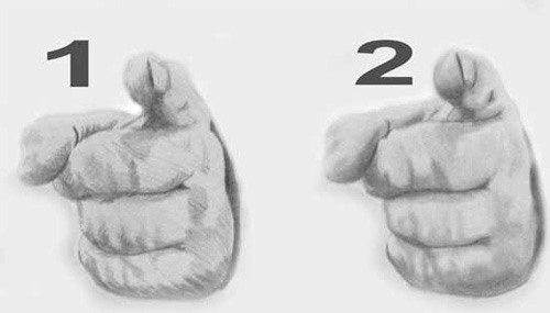
Below you will find an image of two pencil drawings.

1.    This first image has been drawn with a 5B graphite pencil, using a hatching and cross hatching method.

2.    This other second image, has been drawn with a 5B graphite pencil, using a tonal modeling method.

Example of hatching and tonal modeling.
The two methods as example, cross hatching and tonal modeling.

Both depict the shape and form of the image but the second example, is modeled, using the tonal modeling method, notice that the shadows and tones are soft, with few hard edges, unlike the first cross hatching example, with many hard edges/lines.

Essentially there are hatch marks and smudge marks, with both these types of marks having attributes, also associated with the use of charcoal, that enable you to learn to understand tonal variation better.

•    Both types of marks are good and effective in their own right, as well as when used together.

•    Both make excellent drawings, in their own right and when mixed.

•    Both can have specific, common and preferred uses.

•    Both are also used when painting.

•    Both can be used effectively, with other types of drawing tools, especially the hatching marks.

Modern mark making revealed again.

Crosshatching and tonal modelling.

Pencil drawing photo image of a thumb and finger.

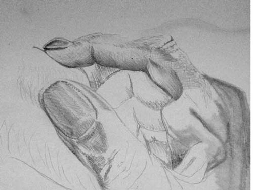
The above is a combination of hatching, cross hatching, line drawing and tonal modelling with only a HB pencil being used to do this.

Crosshatching and tonal modelling.

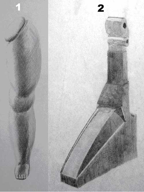
Example of two different mark making techniques, cross hatching, tonal modeling.

  1. Cross hatching style drawing, of a dolls leg but although very messy looking in the detail, it is a fine example of how, even soft flowing shapes can be created with crosshatching.
  2. Tonal modelling or blended style, with very hard edges, although you can see some of the hatching marks showing through as well.

Hatching and tonal modelling revisited.

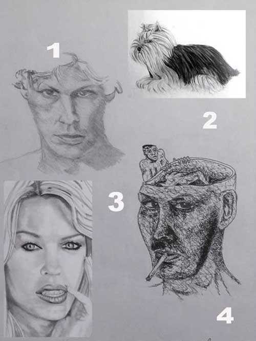
Example sheet showing different types of mark making.

  1. Example of a loose tonal modelling or blending style drawing, of a face that is really somewhere between, hatching and tonal modelling because of the even marks, slanting downward to the right.
  2. A Yorkshire terrier dog, which happily lends it’s self well to this loose but flowing hatching technique, which is highly appropriate for drawing fur or hair, as can be seen a little in image 3 as well.
  3. A soft blending of tones creates this portrait, this is mostly achieved by smudging the graphite pencil marks, with a paper torchon or drawing stump, this is just a hard paper pencil type tool, that can be used to smudge the pencil marks.
  4. Although some like to call this a squiggle or squrkle technique, it is actually just another form of cross hatching, this image has been drawn with a permanent ink pen.

View Gareth Pritchard’s profile on G+
 

Modern mark making, in the context of drawing, a point of view.

I took the charcoal drawing of a 1967, Austin Healey, 3000 Mk III, sports car and super imposed it into another image of a thumb and finger, using GIMP photo editing software, I fused them together to compose the image below, about understanding perspectives and using mark making, as a visual dynamic for tricking the eye.

Pencil drawing photo image of a thumb and finger.In the drawing above you will see two different pencil techniques, one is called hatching and the other is called tonal modeling, both are used often, as drawing techniques for different reasons mostly. The hatching or also called cross hatching technique, is often used to draw subjects, that lend themselves to that type of mark making, like hair, grass and other textures, that can be described with lots of little lines or dashes going all in one direction or differing directions, and is a natural way to use a pencil.

The other technique is tonal modeling, which is where the pencil is smudged or modeled using graded tones, to create soft edges and shadows, most often seen in the drawing of skin tone, and clouds but in the drawing above, you will notice that both are being used in the same drawing.

The finger and thumb of the hand is drawn using hatching and cross hatching, whereas the back of the hand is drawn using a tonal modeling technique. The example is used to show how these techniques, can be used in this way and although they lend themselves to best describe textures that have been mentioned, they can also be used effectively to describe textures, that would not really lend themselves to these techniques, like with the finger and thumb.

This is also an example of how you can take already existing drawings and with photo editing software, fuse them together as a means of generating new ideas, bringing very different tools together to aid the creative process.

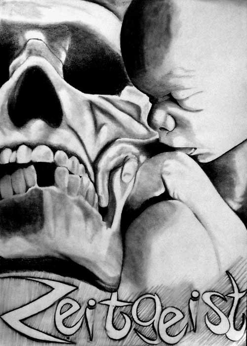
The image below, is almost completely created using tonal modeling and is a example of use, where it would accurately describe the fleshy textures of the baby’s skin tones, as well as, the bone textures of the skull, with the only hatching type marks, being around the word zeitgeist, which are again smudged pencil lines, with slightly modeled edges, that are not sharp or well defined. Mark making is also found in painting as well as drawing and is an important part of all kinds of art, where sometimes they are not lines, dashes or modeled areas but can be splashes, scribbles or pointillist type marks.

Zeitgeist, spirit of the times, pencil drawing.
The Zeitgeist, is the spirit of the times, this is a pencil drawing of life and death, called Zeitgeist .

A hand and the artificial creations, born from its great ability, to manipulate the world around it, isn’t all intelligence artificial because we only think we know, when we recognize the mark making?