Tag Archives: Dimensional Image

Make your own graffiti art easy.

Make your own graffiti art because it’s not as difficult, as you might think, it only takes, a basic knowledge and some practice. There are numerous styles of graffiti, but the most common factors are as follows.

  • They are painted in strong vibrant colors, that often clash.
  • They are intended to be attention grabbing.
  • They are often emotive concepts, that question the norm.
  • They often contain 3D lettering.
  • They often contain lettering that overlaps.

The heavy bold 3D lettering is very apparent, in the majority of graffiti art images and is usually the starting point, for most potential artists, as it most often starts with your name, tag or handle. Many of the same, distinctive, bold style lettering’s, used in advertising to create impact, are also used by the graffiti artist, so are a good place to look, for ideas. It most often reflects and resembles, the branding or advertising art world, in many ways but chiefly as a counter alternative, usually with a strong, social, political massage, that the artist is passionate about.

  • The pictures or pieces of work themselves, will contain sharp hard hitting  contrasts.
  • They will be painted in stark vivid colors.
  • They will be well defined, with strong shadows and outlines.

The best way to start, your piece of graffiti art, is by drawing smaller ideas and outlines, that you can later scale, up to any size, this will help you to understand, the problems you might face, when attempting to create something bigger. Scaling your ideas, is a simple task, once you have a smaller drawing or painting to work from. There is an endless supply of ideas online, if you need them, for fonts to use in your graffiti, as well as examples of graffiti, created by others to feast your eyes upon and incorporate into your own work.

The tools to use for your designs or ideas are, pencils, felt tipped or marker pens and fine line drawing pens, all of these come in a very wide range of distinctive and vivid colors, that make them an ideal choice, for graffiti artists.  If you need ideas for a graffiti font to use, there are plenty of sites online, that have examples for you to copy.

Outlines can be created with a graphite pencil and or any permanent black ink pen but fine line and wide chisel or bullet tipped markers, are a preferred choice of many. Shading around the letters you’ve outlined, with a range of different colors will enhance the 3D effects of your lettering, to make it more distinctive.

Make your own graffiti art because it is really easy, if you use these methods and it is not as difficult, as you might think.Make your own graffiti art, Images of Brynteg, Caia Park Nursery, Gate Hangs High, Chester, Blacon YPP murals on buildings and an installation piece at Caia Park Nursery.
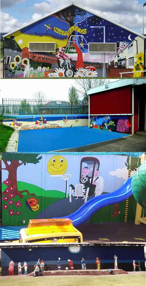
Make your own graffiti art, Images of Brynteg,  Caia Park Nursery,  Gate Hangs High,  Chester,  Blacon YPP murals on buildings and an installation piece at Caia Park Nursery.

Yes I know, that there are many who would not consider this graffiti but I say “make money not trouble”.

When you are ready, to paint your outline drawings and ideas onto canvases or bigger surfaces, you can use the grid reference method, by marking out a grid over the top of the drawing, you want to enlarge. You then recreate this grid onto the area, where you want to redraw, your original drawing and then use it to measure, where everything goes by comparing grids. Very large areas can be marked out with string, by impregnating it with chalk or charcoal, simply by rubbing it into the fibers, when the string is in this condition, you stretch it out tightly, across the area that you want to mark out. Then you pull it out from the middle and let it go, so it then snaps back against the surface of the new drawing area, leaving a mark imprinted on to it.

You can then use the chalk or charcoal to redraw, the outlines onto your new drawing area. Spray paint the main outlines, with a similar color to the background but a couple of shades lighter or darker, so it will cover more easily if you need to change anything later, allow this to dry before continuing.

Then you can begin to fill in the details and your areas of color, with spray paint in much the same way, by starting with the lightest colors first and the largest areas, then putting in the details. Finally you can carefully fill out the black outlines, with your spray paints, adding highlights and finishing touches at the same time, you can even use a brush, to do your very fine details. Once again let me say make your own graffiti art because it’s not, as difficult as you might think, it is really easy, if you use these methods.

View Gareth Pritchard’s profile on G+


Outline drawing.

In the process of drawing images, we often start out with a basic outline drawing, as the foundation, for learning where everything else goes, in relation to the outline and each other. The problem I find with many beginners and well practiced people alike, is they do not always, understand outlines very well, also as in the case of beginners, they do not understand at all, in many instances.

The easiest way to draw and understand outlines, is by using tracing methods of drawing because when you trace an image, you can only, realistically make an outline, as tracing doesn’t lend it’s self to shading. Tracing also gives you a better understanding, of how pictures work, especially when trying to understand, construction drawing.

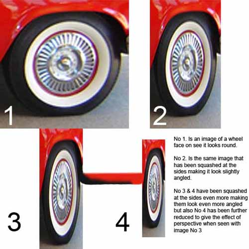
Wheel images showing perspective distortion.
Car wheel images showing distortion when seen in perspective.
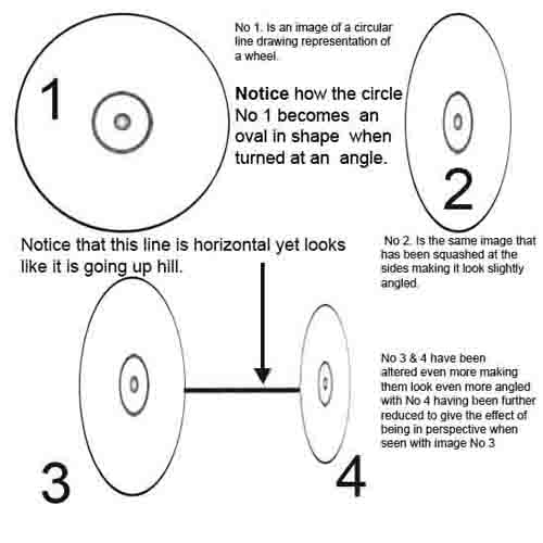
Wheel images showing perspective distortion line drawing.
Car wheel images showing perspective distortion in a line drawing format.

Let me explain, by using a car wheel as an example, we all know that wheels are round but they are only round, when we look at them directly face on, because when we turn them, at an angle, they become, more and more oval, in shape.

The correct term to call this oval shape, is an ellipse and is something many people have problems with, when trying to draw them accurately, to find out more about this, please take look at single point perspective and two point perspective, you will find the both helpful.

Get yourself some pictures that you might like to draw and trace them, so as to be able, to take a look at these images, as only line drawings, you will notice when tracing these outlines, that they are most often, not as you might have thought they are.

Doing this, will help you to understand, that shapes are not often, the shapes we think we see and that wheels, are most often not circular but oval, along with many other shapes we see but actually, only think we see. This is because our brains tell us that wheels are round or that a shape is this shape or that shape, when in actual fact, many shapes are not what we think they are because our brains are telling us what we see, rather than actually, seeing what we see.

Easy drawing an illusion of depth.

As can be seen in the previous post, (“Miki Falls”) manga creator Mark Crilley in his video (How to draw Manga backgrounds) shows, how it can be easy drawing the illusion of depth, by defining the fore ground objects with greater detail and color, than the background objects.

This technique is widely used by most artists to convey the impression of distance but is most often combined, with objects drawn in perspective, which is also covered in earlier posts. This is most often conveyed by putting objects into pictures, as triggers to convey this illusion and help lead the viewers eye, off into the distance along a line of ever decreasing reference points. Photographers use these very same techniques when taking landscape photographs by again placing larger or close up objects in the foreground to create the illusion of depth.

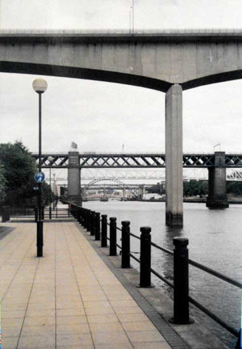
Below is a classic example of this, the photo image shows many parallel lines going off into the distance, with lines between the paving slabs on the ground, the lampposts decreasing in size as they go further into the distance. Then there is the railing along the edge of the water and also the bridges, with first one filling more than half of the picture, with the second only filling about one sixth and the third, being only about one tenth. All this information draws the eye along the lines towards the point, where they converge creating the illusion of distance because remember that this is really, only a flat 2 dimensional image.

Image of bridges in Newcastle, England, UK.
Image of bridges in Newcastle, England, UK, shown as an example of elements that create distance.

Also you should notice how the objects and bridges in the distance are only vague, as they are far less defined than the foreground railing posts, paving slabs and lampposts.

Photographs are a good example of how, these same easy drawing techniques, when applied to constructing backgrounds, create a sense of distance, this can be used to trick the eye into seeing the illusion of depth, without it really being there.

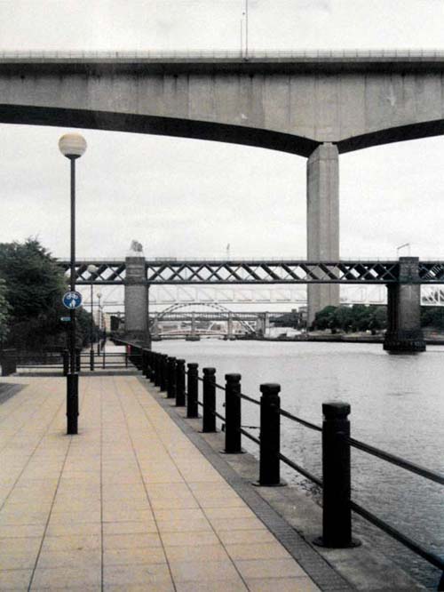
The image below shows how pictures can be changed by moving the order of objects, you will see what I mean by looking at the picture.

Image of bridges in Newcastle Upon Tyne, England, UK that has been edited.
Image of bridges in Newcastle Upon Tyne, England, UK that has been edited to show how moving things around can change their perceived distance and size. Do you think that the concrete bridge that was in the fore ground now actually looks bigger because the upright pillar has been pushed back in the distance?