Composition definition, it’s about putting the elements that make up a picture together.
Composition can also be interpreted as an organizing of art elements according to the principles of art.
According to Wikipedia (The principles of art) are movement, unity, harmony, variety, balance, emphasis, contrast, proportion, and pattern.
Composition principles can also be described as balance, emphasis, pattern, contrast, proportion and gradation.
Composition elements can be described as line, size, color, texture, value, shape and space.
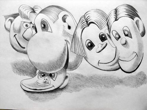
In the image below that was created as scribble heads the composition does not work very well and does not follow the (The principles of art) mentioned above very well at all. You can see the foundation work for this image if you follow the easy cartoons to draw link to see scribble heads.
Let me tell you why the image below does not work by giving you an image that does work and then let you think about what has changed in the drawing to improve on the composition.
Besides the 3 overlapping circles of composition being added to the image what else has changed?
The first image is unbalanced it is does not have an emphasis or good pattern, although contrast, proportion and gradation are good enough. The line, size, texture and value are fine but there is something wrong with the shape and space, so think about what has changed with the shape and space?
Why does the reversal work better, take notice of the direction of the eyes?
What you need to consider is how the lines in a drawing lead your eyes around the drawing so when you place an arrow in a picture it will grab the attention of the person looking at it and they will follow it to the tip. Lines work in a similar way and can be used as capture points but also the direction in which something is pointed can do the same thing, so a face looking to the side will direct your eyes in that direction. Depending on where the eyes are pointed will depend on where your eyes are directed and one of the worst moves you can make is having the eyes looking out of the picture. Now look at the first picture of the scribble heads again and notice that the eyes are looking all over the place with no uniformity, structure or sequence, giving no meaning to the composition.
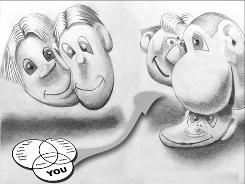
In the last image below it is a different story because the eyes and positioning of the heads says things by the direction of the eyes within the drawing, which head is looking at what or who?
The finished and final composition below works best with the arrow being placed as an attention grabbing device to draw your attention to composition.

View Gareth Pritchard’s profile on G+

